CM3050 Topic 02: Mobile User Interface Design
Main Info
Title: Mobile User Interface Design
Teachers: Joe Mcalister
Semester Taken: April 2022
Parent Module: cm3050: Mobile Development
Description
In this topic, we look at the design considerations associated with creating a mobile app, including the design styles prevalent in the mobile field, choosing a colour palette and what this means for accessibility.
Also covers wireframing.
Assigned Resources
Lab Summaries
2.403: Hack it has you reproduce three design paradigms in styling a button: code is here: Button Styling (CM3050 wk 4)
Lecture Summaries
2.0 Choosing the Right Style
2.001: Design paradigms
App design is critical to user attention, you have to consider current trends and consumer knowledge of other apps when designing yours.
There have been three distinct design paradigms in mobile apps over the last 20 years: Skeuomorphism, minimalism, and neumorphism. These represent drastically different approaches.
Skeumorphism is the process of emulating physical objects in UI design. EG an address book would resemble a physical book. Originates in the early days of GUIs where users were guided to use computers by physical analogies.
It can be realized by using a set of objects (such as elements of the user interface) which can activate a metaphorical or analogical connection to the real world. Having made this connection, the user of the system can anticipate its behaviour. Bruce Tognazzini
It’s all about allowing the user to anticipate behaviour at first glance.
Skeumorphism largely gave way to minimalism, which removes all non-essential elements of the UI, and focuses only on the essential functional elements. Excess decorative elements are removed. Apple and Google adopted minimalist redesigns around 2013.
Minimalist design can be tedious and bland, and less intuitive, without careful thought. You need to make up for the lack of affordances, strive for clarity and a clear visual hierarchy, with functionality at the forefront. Focus on micro design decisions like typeface and colour, remove non-functional dectorative elements.
A potential successor to minimalism has emerged, neumorphism. It’s like a middle ground. Joe presents it as taking a skeumorphic design and painting it in white paint. Shadows and contour remain, but other elements like colour are removed. This is praised for combining the freshness of minimalism with the familiarity of skeumorphism.
However, is neumorphism accessible? There are problems in relying on minimal contrast, and shadows.
2.003: Colour and Mood
Colours have a strong relationship with mood, and the colour palette of your app can affect users’ mood.
Brands use this. Why are social media apps all blue? Blue is a popular colour, it conveys calmness, serenity, stability and reliability.
Fast food is always red and yellow - conveys speed, immediacy.
Apple use white, simplicity, calm, professionalism.
2.1 Dark Patterns
Dark patterns refer to design choices that are made to make the user do something they don’t want to.
Eg highlighting buttons the dev/company wants you to pick, rather than what the user wants.
There are lots of dark patterns out there, documented on the dark patterns website. Here are a few:
Trick questions. EG opt out instead of opt in.
Price comparison prevention, eg using units that aren’t equivalent.
Confirm shaming. Negative reject confirmations to shame you to choose another options.
2.2 Wireframing
Wireframes allow you to quickly design layouts to demo an idea and check it for practicality visually. It sits between rough sketches and design prototypes.
It is not designing how the app is styled. It’s focused on the elements and their layout.
You can revisit them after prototyping.
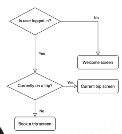
Map out the target user flow to get an idea of how many screens you will need, and how the user will go from one screen to another.
You can represent the flow with boxes and arrows denoting how one screen is connected to another.
Flow is top down, so the top box is your entry point.
These diagrams give you a good chance to spot any issues with your potential flow. So if a user has to go through three screens to access a key feature this should maybe be simplified to a single step.
Keep flows minimal so the content users want to access is a tap or two away.

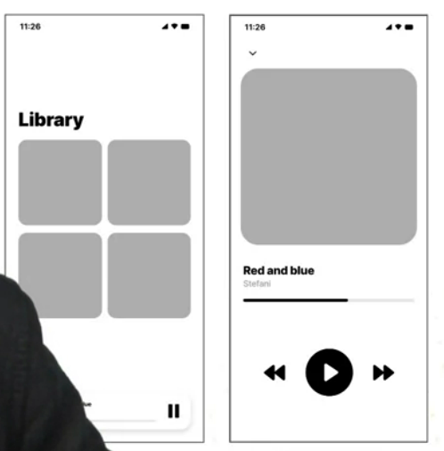
After the flow diagram, consider mid-fidelity wireframes, ie a diagram that is semi-realised. Some details, but refine small details later.
There are many wireframing tools. Create it within the dimensions of the target device.
First layout boxes representing elements, then bring in design patterns and actual copy, like welcome text. Like this:

Definitely good to wireframe for small screens as they are challenging for content-rich appliations.
If the wireframe tool allows it connect the screens so you can follow the flow. Get feedback early and often.
2.4 Styling in React Native
It’s common, but not essential, to have a ‘root’ view - the container view - as a container for the elements of the app.
Styling can be inline or with Stylesheetx . For inline we can just say <View style={{width: 200, height: 200}}>.
Better practice to do Stylesheet styling for reuse and readability.
Dimensions (width, height) can be raw pixels, %
It all behaves a lot like CSS with some minor differences.
Borders are inside the element. You can set borderColor and borderWidth, padding inside the container with padding or paddingTop etc.
Common to add more padding to the left and right than top and bottom.
Padding adds space within the container, margin adds space around it.
We don’t seem to have the same selector power (first of type etc) so when he wants to apply a style to just the first button, he has to switch to inline, or create a whole new style class for the first one…
You can add an inline style to a Stylesheet to override in this instance. for example: style={[styles.blueSquare, {marginBottom: 20}]}
Some people don’t like this, but Joe is fine with it.
2.5 Resposnive Design
2.501 What is Responsive Design
We build based on proportions, not specific dimensions. We also change layout based on different display sizes.
In RN we use flexbox. Here’s an example:
<View style={{flex: 1, flexDirection: "column"}}>
    <View style={{flex: 1}} />
    <View style={{flex: 2}} />
    <View style={{flex: 3}} />
</View>
Now the bottome view gets 3/6, middle gets 2/6, top gets 1/6. We can also specify the container’s flexDirection:
column(default) children aligned top to bottom.rowchildren align left to rightcolumn-reversechildren aligne bottom to toprow-reversechildren align right to left
There is also justifyContent which you’ll use a lot. This denotes how children align along their main axis (the flexDirection):
flex-startthe start of the main axisflex-endthe end of the axiscenterthe center of the main axisspace-betweenevenly space children along the main axis, remaining space is distributed between the children.space-aroundas above, but with the space distributed around the children (so before first child and after last child).space-evenlyevenly distributes children within the container, with space evenly spread between children and between start and end of container.
There’s alignItems which also affects alignment, but on the minor axis of the container. You can use the stretch value here to match the height of the container’s cross axis (default). And baseline to align children along a common baseline - you can set a child to be the reference baseline for their parent. Note that stretch won’t have any effect if the child already has a fixed dimension on the minor axis. (eg if a container is column and a child has a width, stretch has no effect).
You can override alignItems on an individual child with alignSelf
There are playgrounds for justifyContent and alignItems
flexWrap determines overflow behaviour. If wrap then items can wrap into multiple lines on the main axis. alignContent is used to space multiple lines when wrapped.
flexBasis flexGrow and flexShrink are specified on the children of flex containers and determine how they will be sized by their container. Basis provides a default size. Grow (default 0) is used to specify how much the child should grow to fill available space. Shrink (default 1) determines how much the element will shrink if there is not enough space. The values act as weights and the container re-sizes the elements according to their proportional weights.
2.6 Accessibility
Four key categories:
Vision
Hearing
Physical and Motor
Literacy and Learning
Both iOS and Android have great accessibility support available in their APIs, like screen readers. Some of these are OS specific.
React Native provides complimentary accessibility features:
accessible prop, eg <View accessible={true}> when true this indicates the component is an accessibility element. RN will then group the children into a single touchable element for accessibility focus.
accessibilityLabel assigns a descriptive label to an element, read out when the user selects an element.
accessibilityHint describes what will happen when a user performs an action on an element (eg accessibilityHint="Deletes your last entry to the table"). Hint is read out after the label.
Accessibility actions allow assistive technology to programmatically invoke the actions of a component. To support this a component must define the list of actions it supports by the accessibilityActions prop, and implement an onAccessibiltyAction function to handle action requests.
accessibilityRole and accessibilityState also describe the purpose and state of a component in assistive technologies.